You better not
Make something really beautiful - sometimes you shouldn't. Because beautiful doesn't always work!
More...
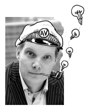
A consultant wanted illustrations and banners for his website. I suggested a nautical theme because I found his work matches a tugboat that helps a freighter or other vessel get through a difficult part of a body of water. Or with a pilot who can help plan a new course, while the captain (CEO) remains at the helm.
That image worked well for his services. I got to use humor in the illustrations which made his company warm and human. And in which he could recognize himself.
I went all out
I went all out with the theme. In a banner I wanted to draw the difficulties in which an organization can find itself. I drew a storm and in my minds eye an iconic image of an old three-master in foaming waves.
Wauw! I fell in love. I worked out this classic image in another style than the other illustrations for this client so far: more details and very fine lines. A lot of work, but it was worth it, a beautiful old schooner in a rough storm. I was right on course! Or so I thought.
I even started changing the other illustrations in this style.

Anton de Gier of AppliedVisions
Killing my darlings
But my client put on the brakes. He wasn't keen on the fancy image of the three-master in need. He thought the stylized execution was too unapproachable and lacking humor.
He was right, I realized with a shock. I let myself go in drawing the details of high seas. I had lost the objective. There lay a beautiful picture but what message was being told here?


Beng Beng
This was a wise lesson in illustration. It's all for telling a story or getting a message across in my work. Of course: the illustration needs to be good. And nice to look at. But the image in itself is not the sole purpose. I'm vigil not to lose myself in the most beautiful result.
Eventually I pictured an lighthearted and recognizable image about the problems with teamwork. This image shows the story plainly and is therefore the client's favorite.


